I created these animations in Adobe Photoshop. I created the animation by finding a tab at the bottom and pressing 'Create Frame Animation'. From there, I created a layer and wrote my name in a layer I wanted to use throughout the animation. I then made more layers and changed the position of my name in each one. Once I had done this, I tweened the frames which created many more in-between the already existing ones making it move smoothly once played.
I did the same on the animations underneath although I started with the ball of the page.
To make it fade in and out I changed the opacity of the ball with each frame so that it gave a fading illusion.
Second GIF
Third GIF

In this final animation, I did the same. I used three different layers to work on three different objects at once.
Factoid Workshop (Practice)
Poster

Cowspiracy Notes:
Al Gore, VP - Climate Change Activist.
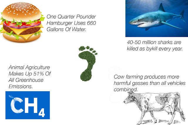
Cow farming produces more harmful gasses than all fuel vehicles combined.
100 Billion Gallons of water used in mechanical equipment, Cow farming uses 34 trillion yearly.
One quarter pound hamburger costs 660 gallons of water.
65% of the worlds nitrox oxide comes from cow farming which is 96% worse than co2 that comes from vehicles.
Leading cause of habitat destruction, dead ocean zones, and even animal extinction.
Methane from farming
Humans and animals we own make up 98% of biomass, in comparison to the 1% 10,000 years ago.
91% of environmental destruction is done because of animal agriculture and livestock farming.
Organisations hide from animal agriculture as its bad for their brand as they need a solid line of funding.
51% of ALL greenhouse emissions.
Ocean ruined by toxicity of feces.
Fishless oceans by 2048, scientific predictions.
40-50 million sharks killed as by-kill every year
Serial depletion
The rainforests are being damaged at the speed of one football field every second.
Environmental communities refuse to speak and act out against animal agriculture and farming
Animation
Animation Evaluatio
Use of Color
Since my animation's fact is about shark bypass killings, I decided to mainly use blue (as the background), in reference to the habitat of the animals and red, representing their blood in the water. On top of their meanings, it's extremely easy to read as red is a complimentary color.
Text
I tried to find a font that looked like blood dripping, which is why I used the font I did. As for actual text, I made my point clear and concise while still being easily readable for people viewing. I chose a different font for the second part of the animation. This text was much bigger and bolder. I did this as this part is the main point of the animation telling people that animal agriculture isn't acceptable and we should stop.
Imagery
I think I could have done a lot better on the image I used as it is very cartoony where as the rest of the animation is very serious. I also think I could have implemented a few more images into the animation as there is only one. Although, the image used was relevant to the text and point being made.
Information Hierarchy
I decided to put my actual statistic and fact before the "STOP ANIMAL AGRICULTURE" screen as I think generally people are more absorbed and attracted to facts and statistics they don't know so they'll read and stay at first glance. Where as if I started with the latter screen, they wouldn't bother continuing to watch as they have no reason to care about animal agriculture as in everyday life it's a tragically overlooked issue.
Tools and techniques
I created my whole animation in Adobe Photoshop. I created the animation by finding a tab at the bottom and pressing 'Create Frame Animation'. From there, I created a layer and brought all my layers I wanted to use throughout into the first frame. I did this for convenience purposes later on so I wouldn't have to keep making this invisible in later frames. I then made the text I was using in the first frame visible. I then went into the second frame and made the next part visible, while moving the positioning of the first frame's text so when played it moved. I continued doing this for the rest of the layers. I also used techniques like changing the opacity so that things were clearer. Once I had done this, I tweened the frames which created many more in-between the already existing ones making it move smoothly.
Most successful thing about the animation?
I think that the animation's most succesful feature is the choice of color and text, I think the colors compliment each other extremely well and the text gives off the sinister, blood-like feel I wanted it to. I also think the animation looked pretty good, although if I had a chance to redo it, i'd put more frames in the animation in general so it appeared more smooth.


No comments:
Post a Comment