Tuesday 29 September 2015

Graphic Narrative - Paul

Perhance to Dream,  Reviewing a graphic novel.

The Colour - The colours used are appropriate and the ways they're used are very clever. When the characters are talking in the dream, the colours are bright and unrealistic and when they talk in reality everything looks more natural and blunt. There isn't a wide range of colours however, just simple, primary colours with different tones.
The Text - I think that the text is pretty boring as it's all just plain text, all in the same size and all the same colour. The only time that the text changes is when they put some in capital letters so you know that it's important although they could have done more.
The Use of Images - All of the images are hand drawn and then put into photoshop. I think most of the images look pretty good but it's clear that some were reused where they have just been flipped around.


Artist Appreciation - CentralIllustration.com

CIA's, or Central Illustration's, work is the most inspiring to me.

CIA are based in London and are considered to be a huge inspiration to online graphics in the UK.
They focus on 'Contemporary Commercial Art and Interactive Motion Graphics.

They have done projects for multiple museums and companies but they also do work for individuals.

                                                                 
                                                               I specifically like this project done, by artist Jonny Wan who works for CIA. He travelled around to multiple countries and made different bits of work about what he saw and the general culture of the country. I like the 'cartoony' style he used in the majority of the work. There isn't much text used in the project although he primarily uses bright colours on top of each other so they stand out.    


Jamie B Edwards (urbancolors)

This is Jamie B Edwards from Urbancolours who does football related artwork. He also does large landscape images of cities in this same style. I like his work a lot and it looks like something I could try and recreate in my work. I like the use of all his colours and how they compliment each other with complimentary colours. He tends to stick to very bright images all the time. He makes his work very realistic usually although he tends to colour the sky the colour of the football team's stadium in that piece of work.

Jamie tends to stay away from text as he doesn't think it belongs in artwork (www.urbancolours.com). I like the way he does this as it lets the image tell the whole story.
In general, my favourite thing about his work is the fact that it looks very real. You could go to Everton's football ground and see what's in the picture. It's almost like he takes pictures and recreates them on Photoshop or Illustrator.


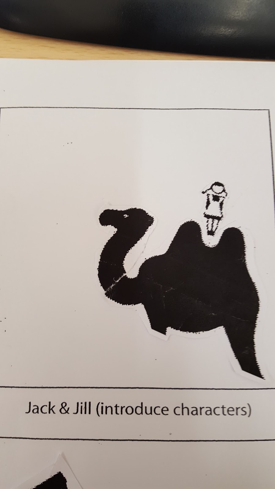
Jack and Jill Workshop 


BMD Design


BMD are a French design organisation.

I think their work is really appealing and their use of words inside of the actual images almost makes it look like the objects are made from the words is very clever. Their use of complimentary colors on cool colors makes everything stand out and their use of color is always appropriate to the image.

I think taking inspiration from their work is a good idea for our graphic narrative as, to me, their work gives off quite a dark and eery feel. Looking at their website, the majority of their work is done in dark blue or black.


                                                                                                                                                              Statement of Intent - 

What Grimm tale have you selected and why?

I chose Little Red Riding Hood because I think with one of the main characters being a wolf, it would be relatively easy to turn it into a more sinister graphic. I also know the story well and find it already enjoyable so I think this is the best one for me to do.


What format will your Graphic Narrative take?
My Graphic Narrative will take the form of a comic book because everyone knows the story of Little Red Riding Hood so putting it into a comic without words will be interesting as everyone will perceive it differently.


How will you change your script to make it more modern, historical or futuristic twist to your script, illustrating a mood/style or intended target audience?
I am keeping the story as it is throughout the most part, although I am changing the classic ending with a more dark ending where the wolf actually kills Red and her grandmother. I have decided that I am also going to keep the friendly appearance of the original story so that the ending is more of a shock. I have also decided to take out one of the characters - that being the lumberjack who eventually comes to Red's aid.

What designers or illustrators do you feel will influence and inspire the style you are working toward and why?
I would like to use inspiration from the CIA, whose work I analysed above. Although I don't think that their style would work for a dark tale as they use bright colours in their work. So I don't think I will have any influence.

I am going to create my product in photoshop only as it is what I am most comfortable with. I am going to need to use a variety of tools, although mostly the shape tool, magic wand and crop. I will also use other techniques like changing opacity and depth of images and even text.


Final Product -                                                                                                                                                                                                                                                            


EVALUATION OF FINAL PRODUCT
Above is my final product. I swiftly decided to use photoshop to produce it as opposed to Illustrator as I am much more familiar with Photoshop and it's tools. I used many different tools to make it. Mainly, I used the shape tool and the crop tool as I had to draw a lot of shapes onto the frames . I drew the backdrop squares to create the sky and grass illusion. I also drew the clouds and had to draw many squares to cover spots which looked bad or didn't crop correctly. In my narrative, I gave the ending a dark twist although with the colours and start of the story, I kept it bright and upbeat so it seemed like the original tale. I also didn't give it a definite ending so the consumer could decide how it ended in their head - I thought this gave it a more interactive feeling. Instead of just having frames, I decided to have boxes at the bottom of each frame that was a text narrative that you could follow. I think overall my narrative was good, in terms of quality. I feel like I could have gone with a more dark visual so that it was clear I had put a twist on it although if you follow the narrative you can notice. I also think I could have made the frames clearly as in the forest scenes there's a lot going on which forces some of the images to over lap. I think It was right to add some text, as well as have a graphical narrative as it could have been hard to follow. I didn't use to much as it's not needed due to the graphic being the main story-teller.


Friday 18 September 2015

Factual Programming

Codes and Conventions of a Factual News Programme 

News reporter(s) sat at a desk/sofa, sometimes standing after a cut,
Shuffling papers on desk/table,
Dramatic intro with high intensity music,
Cuts to anchors who are live at an event or in a different country,
Interviews/talks with experts,
Talks with people in the current news or celebrities,
Green screen,
Screen displaying facts while the reporter reads about the stories,
Voiceovers,
Aggressive interviewing 

The Newsroom Episode 

How does the episode of The Newsroom highlight the codes and conventions of the factual news programme?
It showed a lot of things we talked about in class like the dramatic introduction, the interview with a specialist about an oil tank leaking. It showed the news reporter aggressively interviewing the specialist. It had no green screen however it had the newsroom behind him which is common among factual programmes. There were a lot of voiceovers as well.
How does the episode focus on the issues facing producers of factual programmes?
It emphasised on the credibility of the journalists as their reputation would have been ruined if they reported false information about the oil spill. The three producers had to decide whether the new journalist's sources were as credible as he said as the whole stations reputation and the broadcaster's job was on the line. It also showed how they prioritise what they show as one of the producers wanted to run a normal news programme as he didn't trust the new journalist but the other two wanted to a run an hour special on the breaking news about the oil spill and they eventually decided to run the hour special which got their channel a lot of viewers and publicity although it was risky.


Documentary Genres:

   Interactive Documentary - The presenter/film maker takes part and interacts with the people and uses a wide variety of multimedia tools to have a more direct connection with the audience.
Investigative Documentary - Introduces a problem or question, which it then goes on to solve. 
Observational Documentary - Observational documentary simply attempt to document lived life with no intervention or as little as possible. The earliest documentaries of this genre date back to the 1960s. New technology has made them a lot more possible with new hand-held equipment and sound recording devices.
Expository Documentary - These documentary speak directly to the viewer, they are made to persuade. They use a lot of voiceovers and often have a strong male voiceover. They often propose an argument and a strong point of view.
Mockumentary - A fiction film that uses the 'documentary format' to suggest the scenarios on screen are real life situations that have been captured by a production team. They often parody Observational style documentaries. They often use unknowing members of the public to give a sense of realism like a normal documentary.
Docudrama - Docudramas use fiction and actors to recreate a time or an event. On stage it's also known as documentary theatre. 

Case Study - The Greatest Movie Ever Sold

1. What did you expect from the documentary?
I expected it to be, as it was, a sellout. I expected it to be comical as it was done by Morgan Spurlock and I expected it to be done unprofessionally like most of his documentaries but I also expected to gain some knowledge about how companies and organisations make deals with movie makers / studios about putting their products in the movie.

2. What mode / type of documentary is being used? Give examples.
Spurlock uses an interactive mode documentary like all of his documentaries. He speaks directly to the audience as much as he can, for example after every interview he'd give his opinion to the audience about how it went. He also makes it feel very personal as he lets you in his home while he rings the companies he's trying to get to sponsor his movie.

3. What codes and conventions of factual programming were evident?
Voiceovers,
Desk with papers,
Interviews/talks with experts,
Infographics / screens with information.

4. What do you feel the director set out to achieve with the documentary? How has he employed imagery and sound?
He initially set out to fund the film by product placement payments and those payments only, he set a goal of 1.5 million dollars. I think Spurlock tries to give the audience insight into what small, inexperienced filmmakers have to deal with and do to get sponsored by professional companies. Spurlock claimed that he contacted over five-hundred companies, so as you can tell getting the 12 companies to finalise all the payments wasn't easy. The imagery is an odd one because he could only use certain things, for example, he held a bottle of POM Juice at all times and only drove a mini throughout the film. Spurlock reached out to indie/rock band 'OK Go' and they produced a single 'The Greatest Song I Ever Heard' which is used all throughout the film.

Powerpoint


Issues Facing Factual Programme Producers